04 May

Abstract: In this article we will look at why words alone are not enough when you embark on plain language projects. And why design alone is not enough when you embark on document or communication redesign projects. And lastly why design and words working together provide levels of comprehension that neither can achieve on their own. This article will explore the research, methods and metrics that help to ensure that outcomes related to communication design are measurable and achievable.
(We ensure that the new documents “work” by using a methodology to test new communication designs (language + visual) that can inform you of the likely outcomes from a redesign/rewrite project. We call this Design-thinking for documents Dt4D ©)
How hard can it be to get communication design right?
All you need are 2 simple things:
- Plain language – just rewrite the words and sentences in simple, clear, every day English, order your ideas with a logical structure, focus completely on the document’s audience and purpose.
- Visual Design – and then just design a pleasing and easy to navigate layout.
However most companies do one or the other, or don’t give deep consideration to how they work together. If you think about either of them as separate disciplines then the outcomes you seek will always be compromised. And even if you get synergies from combining both you’ll still need a third and critical element if you want to make a dramatic improvement in your communications and the resultant customer experience.
That’s designing and writing from the customers’ perspective, as in, how they behave (the choices and decisions they make) when you communicate with them. We’re going to explore why the 3 elements are so important and also provide a framework for measuring the cost or value of current communications, and how you can measure the effectiveness of any new communications against those metrics.
First a bit of context. Let’s agree that communication and communication design is an important element in customer experience. And customer experience, or the lack of a positive customer experience is, by and large, one of the major reasons that customers vote with their feet and change their loyalties.
Lose half your customers every 5-years
Depending on your industry a 5% improvement in customer retention rates will yield between 25% to 100% increase in profits[1] yet research by Frederick Rechheld of major US companies[1] revealed that they lose half their customers over a 5-year period; half their employees in 4, and half their investors in less than one! You could argue that this is “just the way the world is now” with transience and portability the norm. But some companies seem to have figured out how to attract, retain and grow their customer base. And avoid the 25-50% stunting of corporate performance that occurs as a result of a lack of loyalty. How did they achieve this?
There is no one “catch-all” — that is, those companies focus on delivering better customer experiences across all touch-points. And an important part of that better experience is excellence in Communication Design. By making the customer the pivot point of their thinking, they become more customer-centric, the customers are more satisfied, less likely to jump ship and more likely to recommend the company or to become brand advocates.
Being customer-centric means that as an organisation they have moved along the maturity curve of Customer Experience. Although technology plays a role in communication design, it should be considered after we understand the customer’s current and future behaviours in response to what we send them, not before.
Too often, a new IT project to replace document composition or digital marketing platforms are taken at face value as, “providing better customer communications” or “enabling multi or omni-channel distribution.” But few organisations couch these projects in terms of ROI’s on either the cost to the organisation in serving the customer, or the value created from doing it better. Even fewer organisations compile data about their customer churn rates and what their investment in the latest customer communication technology has done to address the issue.
Equally, ROI’s tend to focus solely on quantitative measures whilst ignoring the critical qualitative measures that allow you to understand what connects you and your brand with people – your customers. Behavioural research allows you to weight the things that your customers attribute value to, and to understand the things that drive their choices and decisions.
We’re constantly intrigued and amazed when researching our customers’ customer’s behaviour as it applies to the documents or communications they receive. As an example, we recently received a client requirement to redesign their insurance policy renewal notice. With the best of intentions they established an internal working group to look at the problem. These were the things they were thinking about:
- Firstly, time is of the essence – “we need to do it quick!”
- We need to look at some industry examples where a new design had improved renewal rates or uptake
- Whether a letter performs better than a bill as a format?
- What does best-practise look like (competitive analysis)?
- Recommendations on style for different market segments
- Consider the use of inserts
Unfortunately an all too familiar picture but what’s wrong with it? And what does a better approach look like?
[1] ‘The Loyalty Effect: The Hidden Force Behind Growth, Profits and Lasting Value’ Frederick F. Rechheld, Thomas Teal, 2001
Nirvana: communication design = processing fluency
Before looking at metrics and baselines let’s understand the concept of processing fluency – what makes communication easier to understand and act on for your customers.
When we are the customer who receives a letter or bill that is difficult to understand what happens to us at an emotional and cognitive level?
First, we respond emotionally with an “aaarrrggghhhh” or suitable expletive. Then we feel a bit dumb for not being able to “get” the document quickly and easily. “How many times do I have to read this?” we mutter under our breath.
Or if the document is a bill then it goes to the bottom of the stack to be re-read later. Invariably it is not paid on time and costs us a penalty, or makes the organisation generate an equally confusing reminder before we eventually pay and make a silent note to change provider.
This scenario describes what we call processing fluency – a fancy name that simply means how easily we process information. And this is where visual design and language meet and can create powerful synergies that enhance communication . . . making life easier for customers (they pay, and on time), making them less likely to change providers and more likely to recommend us. This sort of communication also helps to eliminate the need for duplicate processing (cost) for your organisation.
What makes a communication easy to process?
So we have touched on processing fluency – where we see that great communication design directly affects how easily a person can process information. We can also create positive emotional responses to information presentation when it is aesthetically pleasing, easy to navigate and easy to understand.
Think about the analogy of your friendly Satellite Navigation (very friendly if you chose the Swedish female’s voice) device. My anecdotal research tells me that the first thing people take notice of is their spatial position – where the image of the car is in relation to all the roads, intersections and Points-of-Interest.
If you get a bit more time or as you get closer to your intended destination, you may notice some of the textual clues – the name of the street or motorway. Finally you may take note of Helga’s (she – the Satnav – has to have a name) instruction to turn right in 75-metres. My research indicated a surprising number of people turn off the sound or tell Helga to “shut-up, I know I’m going the wrong way!” That deserves a whole other research project . . . but I digress!
How we navigate documents or communications isn’t much different. We start with visual cues – images, colour and headings that take us to the area of interest – “payment due by”, “how much”, “your balance” etc. This is also where we have our initial emotional response to the document – is this going to be easy or difficult? Then we might read the initial information – that gives us the tone of the communication. And finally we get into the detail – what the transactions were or what does our insurance policy cover us for.
And that’s communication design. We’ve seen many bad examples – try 2-minutes to find the phone number or complete inability to decipher legal jargon around insurance cover.
- The definition of a Flood, a storm, rising river level and overflowing drains . . .
- The difference between an incident and an accident . . . If an incident (lightning hit a tree) causes an accident (I swerved to avoid it) am I covered or not? Or what about an accident (I drove into a tree) causing an incident (the tree fell on your house). Or was that an accident, or an incident, for you too??
A real customer example . . .
By way of example, let’s say this insurance company with 1.2 million customers. And let’s assume that we reach one third of those customers every year with a digital communication of some type (assuming they have allowed us to via an opt in – wouldn’t want to upset the regulators, would we?). So that is 400,000 communications.
The question of course is; how many of those customers transacted business via or from the digital channel, say renewed their policy?
Even at a stellar conversion rate of 1 in 3, that’s just 133,333 policy renewals online. And of course the cost of service is apparently low . . . But is that because we didn’t include the costs of the people, processes and technology involved in the identification, segmentation, software, messaging, rules, archiving and data enrichment that are required to make it work?
And ignoring that we still have the “legacy” of more than 1 million customers that still renew — every year — from the good old paper renewal notice landing in their letterboxes.
The next questions we may ask?
- How much did we invest or spend (people, processes & technology) in improving our communications to those 1 million (89%) or so customers?
- And how does that investment or spend compare to the digital channel, especially the fully costed digital channel?
This example is not meant to diminish the value of the digital channel but it highlights the importance of understanding and prioritising what your primary communication channel is and therefore informing the decisions you make about your marketing mix and spend.
How much do we invest in our channels?
The above scenario illustrates the importance of understanding metrics. Metrics such as:
- What channel communicates most value for us, and for our customers;
- Where are the growth or decline trends;
- How much does it cost us versus how much return do we make by each channel?
- Do our customers understand what we send them?
- . . . and if they don’t, then how much does it cost us? From a financial, brand and loyalty perspective?
It’s only by asking, researching and answering some of these questions that we can begin to sketch out scenarios of where we might invest our time, money and effort to improve customer experience and value over time. And knowing what drives value (return) allows us to prioritise our marketing budget according to the channels delivering the most value.
Here’s a sample of some of the things that should be considered:
Table 1: What to consider in communication design
| Strategy | Do you have a document design strategy? A customer communication strategy? Are they aligned to an enterprise view of customer experience and loyalty? |
| Audit | Do you understand all the communication types that take place with your customers? Do they speak with one “voice” in the same “brand” style? (Or are they all over the place?) Have you done competitive research, gathered baseline performance data and conducted customer research on your current communications? Do you know what your customers consider valuable, and the things that drive their choices and decisions? |
| Literacy | Do you understand the literacy levels of your customers? Have you adequately segmented[2] so that you can write appropriately to them? |
| Subject matter familiarity | Does the content of your documents reflect your customers’ likely level of familiarity with the topics that you write to them about? |
| Visual design | Have you designed, tested and used appropriate visual cues, use of white space & usability logic to enhance the aesthetics of the communication & assist the reader to navigate the document (read what you want them to read)? |
| Usability | Do you understand whether the communication provides a better customer experience? Did you live up to best practise from a user-centred design (UCD) perspective? |
| Medium (context) | Does your communication adhere to best practise usability whether it renders as an email, printed document, SMS or dynamic digital document on whatever device the customer is using? And does it scale for the recipients intended device (Smartphone, tablet, TV or desktop)? |
[2] As an example, education levels dramatically affect literacy levels, as does ethnicity and age. Understanding, or collecting data on these attributes allows you to more effectively design for your readers. ABS Research – Adult Literacy & Life Skills Survey, 2006
What the researchers say works best
Let’s ask the question: “Why does a document need to look nice?”
Simply put, people prefer things that look and feel good. Love it or loathe it, people buy great design and beauty. They buy an Apple “i-Anything” over a Windows version because, apart from function, it has an aesthetic quality unmatched by the PC manufacturers.
But why is design so important in communications?
Research[3] since the 1960’s into non-verbal communication showed that our emotional response to communications is divided up as follows:
- up to 55% for non-verbal;
- 38% is paralinguistic (the voice, inflection and sound – the way the words were spoken); and
- just 7% relates to the words themselves.
That means that our response to communication is 93% non-verbal. Or if you think about it another way, when we’re busy arguing with our favourite call centre the best level of understanding we can achieve is just 45%. The major medium of understanding – visual – is excluded from the call.
Importantly this research is mirrored in how people receive, perceive and act on written communications. Truly, a picture tells 1,000 words. Research conducted by 3M purportedly found that humans process visuals 60,000 times faster than text. Although this research is difficult to track down or validate (see – 60,000 times faster than text! Really?), there is plenty of unequivocal research that supports the efficacy of visual communication over oral or written.
[3] Professor Emeritus Albert Mehrabian http://www.businessballs.com/mehrabiancommunications.htm
Use colour
According to the research, colour communicates more effectively than black and white. How much more effectively? Here’s what the research says:
- Colour visuals increase willingness to read by up to 80%.[4]
- Using colour can increase motivation and participation by up to 80%.[5]
- Colour enhances learning and improves retention by more than 75%.[6]
- Colour accounts for 60% of the acceptance or rejection of an object and is a critical factor in the success of any visual experience.
- Using colour in advertising outsells black and white by a whopping 88%
Yet another piece of research from the Wharton Research Centre found that visual slides had a dramatic effect on message retention – 50% after 3-days versus just 10% for bullet points with text.
We also have our own experience as a guide – the use of red lights rather than text on a sign saying, “STOP”, the animal kingdoms’ use of colour in natural selection – the red back spider is telling you what? Not “pick me up!” And from business common sense: the 700–million colour highlighters that are sold every year must mean that colour is doing something right . . .
So we all agree that colour and the selective use of colour in our communications can dramatically improve a customers’ comprehension and call them to action. But in our practical world we see so many examples of colour used out of context, ineffectively or just plain wrong! We know red is a colour to highlight attention, a call-to-action if you like. If you use spot red to highlight that a payment is overdue or the date due then this will likely result in achieving the desired outcome. But the same approach amidst a sea of red highlights, logos and signatures quickly confuses the reader and loses impact. Is anyone reading this thinking about one of those favourite charity/fundraiser Direct Mail pieces with offers too good to refuse, “but wait there’s more”, “plus the steak-knives”, “if you enter by this date,” etc. There are so many colours and so much going on in the mail piece that you lose attention and file it in the bin!
[4] The Persuasive Properties of Color; Ronald E. Green; Marketing Communications, October 1984.
[5] Loyola University School of Business, Chicago, IL., as reported in Hewlett-Packard’s Advisor, June 1999;(http://www.hpadvisor.com).
[6] The Power of Color; Dr. Morton Walker; Avery Publishing Group; 1991.
So what are the elements that work – tried and true?
Before we look at what works in communication design, try these 2 simple exercises. Take a look at the image and the text below:
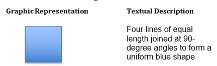
Do we get a better understanding of what a square looks like by the picture or the words that describe it?
This does not mean that images are better than text. However, the combination of graphics and words has a communicative power that neither possesses alone. J.R. Levin said it best in A Transfer of Appropriate Process Perspective of Pictures in Prose: “Pictures interact with text to produce levels of comprehension and memory that can exceed what is produced by text alone.”[7]
Try exercise 2: read the instructions in the table below – ‘What a difference a font makes.’ Does the exercise at the top seem easy to follow? And does the exercise at the bottom seem difficult to do?
Table 2: What a difference a font makes
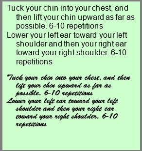
When study participants were given these easy-to-read instructions at the top, they thought the exercise wouldn’t take much effort and that they could fit it into their schedule.
When the exact same instructions were displayed in a less legible typeface (shown at the bottom), participants thought the exercise would be difficult to perform and would take almost twice as long to get through[8].
The initial instructions were easy to understand – they exhibited high processing fluency. This had the effect of creating a low processing fluency for the bottom text piece and the participant’s judgment of the exercise itself.
[7] J.R. Levin, A Transfer of Appropriate Processing Perspective of Pictures in Prose, (in H.Mandl and J.R. Levin [eds.]) Knowledge Acquisition from Text and Prose (Amsterdam: Elsevier Science Publishers, 1989)
[8] Song & Schwarz, 2008
Introducing Communication Design & Design Thinking – Dt4D©
We think Communication Design is simply a holistic, design thinking approach to communications. Effectively, it is an empathetic looking at human behaviour as the reliable guide to ideate or innovate transformative new communication approaches, systems or designs.
It features a rapid prototyping phase to test new designs before committing to development and implementation. Communication Design is our term for this process as it is applied to the various documents, messages and information that companies generate and distribute to their customers. Combining the essential elements of usability – visual design and plain language – with a design-thinking based methodology, we call ‘Design-thinking for Documents’ – Dt4D©
We watch how our end customers behave when presented with a document. We gather data on the customer’s behaviour – we watch what they do (rather than listen to what they say they do). And we use this information to develop document prototypes for testing that will allow customers to understand and act easily, and without requiring any further contact with the organisation. At the same time, we make sure the documents are aesthetically pleasing to the customers’ eyes.
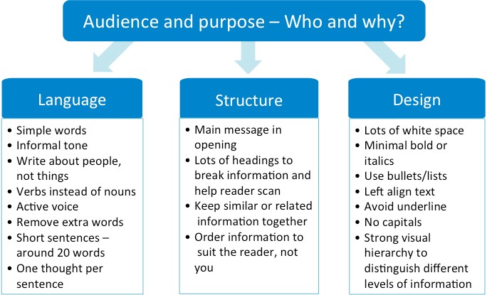
Table 3: Successful elements of communication design
10 takeaways:
- Humans are hard-wired to respond to visual stimuli. When we were born, we saw long before we spoke and even longer before the words made any sense. Our earliest ape descendants likewise acted on what they saw, then what they heard. When they saw T-Rex approaching they ran (fast). When they heard his roar they ran even faster! But we didn’t spend much time trying to understand what the roaring was about (generally we associated sight & sound with, “he’s hungry and dangerous”). Our flight or fight response to what we saw and what we heard helped us survive.
- Design-thinking is focused on achieving visual clarity – use a visual hierarchy (without visual hierarchy your customer doesn’t know where to look first – its like your Satnav having 3 cars to follow) to guide the customer through the information.
- The familiar works better than the strange.
- Go for symmetry. It’s the reason we liked Brangelina!
- Use colour selectively to help customers find what they want or need and to take the action you want.
- Understand colour psychology.
- Test the customer experience. You may not like what you learn or agree with it, but what makes life easy for your customers will make them better customers for you and reflect value in your bottom line.
- We’ve heard it all before but KISS – less is still more.
- Give your words wings – use visual design to enhance your customers’ experience. And use a process or method (like ours) that seeks to understand your customers’ behaviour and how they act when they receive your new, improved communications.
- Life is too short to endure ugly design

References:
- Song, H. & Schwarz, N. (2008). If it’s hard to read, it’s hard to do: Processing fluency affects effort prediction and motivation. Psychological Science, 19, 986–988.
- Reber, R. & Schwarz, N. (1999). Effects of perceptual fluency on judgments of truth. Consciousness and Cognition, 8, 338–342.
- Reber, R., Schwarz, N. & Winkielman, P. (2004). Processing fluency and aesthetic pleasure: Is beauty in the perceiver’s processing experience? Personality and Social Psychology Review, 8, 364–382
- ‘The Loyalty Effect: The Hidden Force Behind Growth, Profits and Lasting Value’ Frederick F. Rechheld, Thomas Teal, 2001
- “Brain Rules” by Dr. John Medina. Brain Rules talks about the Pictorial Superiority Effect(page 233-234), he writes: “If information is presented orally, people remember about 10%, tested 72 hours after exposure. That figure goes up to 65% if you add a picture.”
- Pictorial Superiority Effect is “Pictorial superiority effect.” by Nelson, Douglas L.; Reed, Valerie S.; Walling, John R. published in the Journal of Experimental Psychology: Human Learning and Memory, Vol 2(5), Sep 1976, 523-528.
- J.R. Levin, A Transfer of Appropriate Processing Perspective of Pictures in Prose, (in H.Mandl and J.R. Levin [eds.]) Knowledge Acquisition from Text and Prose (Amsterdam: Elsevier Science Publishers, 1989)
- “Pictures, audio, and print: symbolic representation and effect on learning” published in Educational Technology Research and Development, Volume 30, Number 3 (1982), 163-174 Gwen C. Nugent
- “On pictures in educational research” published in Instructional Science, Volume 8, Number 3 (1979), 235-251. Malcolm L. Fleming
- Duncan Davies, Diana Bathurst, and Robin Bathurst, The Telling Image The Changing Balance between Pictures and Words in a Technological Age. (Oxford: Clarendon Press, 1990).
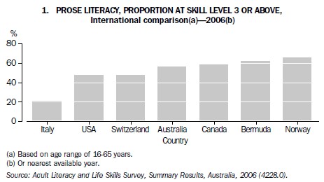
Appendix: How Australia rates for literacy
The Australian Bureau of Statistics (ABS) conducted the Adult Literacy and Life Skills Survey (ALLS) in 2006. It was part of an international study coordinated by the Organisation for Economic Co-operation and Development (OECD) and Statistics Canada, and examined adult literacy in the official language(s) of participating countries. ALLS was a follow-up to the Survey of Aspects of Literacy (SAL) conducted in 1996 as Australia’s contribution to the International Adult Literacy Survey (IALS). Both the Australian studies looked at:
- Prose literacy (the ability to understand and use information from various kinds of narrative texts, including texts from newspapers, magazines and brochures); and
- Document literacy (the knowledge and skills required to locate and use information contained in various formats, including job applications, payroll forms, transportation schedules, maps, tables and charts).
The 2006 Australian survey added:
- a more comprehensive domain on numeracy;
- a new domain on problem-solving skills; and
- a new domain on the ability to understand health-related information (such as reading the labels on medicine packets).
Participants in the studies were rated on their skill level, graded from 1 to 5. Individuals with a skill level for prose literacy below 3 were considered to lack the minimum skills required to meet the complex demands of everyday life and work in the emerging knowledge-based economy. ALLS showed that almost half (46%) of all Australians aged 15 and over did not meet this requirement.